A Study in Comic Book Writing, Creation, and Industry Exploration – Peter
ARTIST STATEMENT
I wanted my project to be tailor-made to suit as many personal interests as possible. I knew the foundation would ultimately have to be artistic, however I elected to add in a sequential storytelling angle both as a personal challenge and as a means of tying all of my work together. Working from a preset script, my project would eventually wind up being a 22-page comic detailing the start of a greater tale. Along the way, I would also interview a variety of professional artists, writers and even editors, and learn from their advice.
The subject matter itself was composed of my interests at the time – I knew I wanted to write a subversive genre story akin to Garth Ennis’ comic The Boys, where the concept of superheroes is presented as an important story element, but not necessarily the focal point. To deviate from that piece, I added a WW2 alternate historical backdrop and a bit of an underlying supernatural angle. From Garth Ennis’s work I also tried to carry over a degree of gallows humor, a set piece that gives a degree of aloof ridiculousness to even the most dire and disturbing predicaments.
To contrast the commonly bright, flashy colors associated with superhero media, I elected to go with a much more true grey monochromatic pattern, utilizing pen and ink along with an ink wash finish. The somewhat dreary—and toward the latter part nocturnal—setting provided a lot of opportunity for experimentation with different tones and emphasis. Though tonally and even stylistically removed, I think my two biggest inspirations ultimately were the works of Junji Ito, with his masterful hand-shading and emphasis on grotesque exaggeration of anatomical proportions; and Edward Gorey, with his eerie and moody backdrops, although I certainly took and still plan to take a lot from the black and white horror and war comics of old.
With this project I intended to not only improve my skills as an artist, but also to address my most prominent weaknesses as a creator and student: namely my slow work process and poor attention span. Drawing a comic under a strict time limit, while maintaining a consistent level of quality, all over a prolonged period of time, is an exercise I developed precisely to address these shortcomings. I took this project not only as an opportunity to make something of quality, but to improve my own workability for the projects to come.
Here’s a link to this unholy magnum opus, and here’s a backup one in case the fancy version doesn’t work.
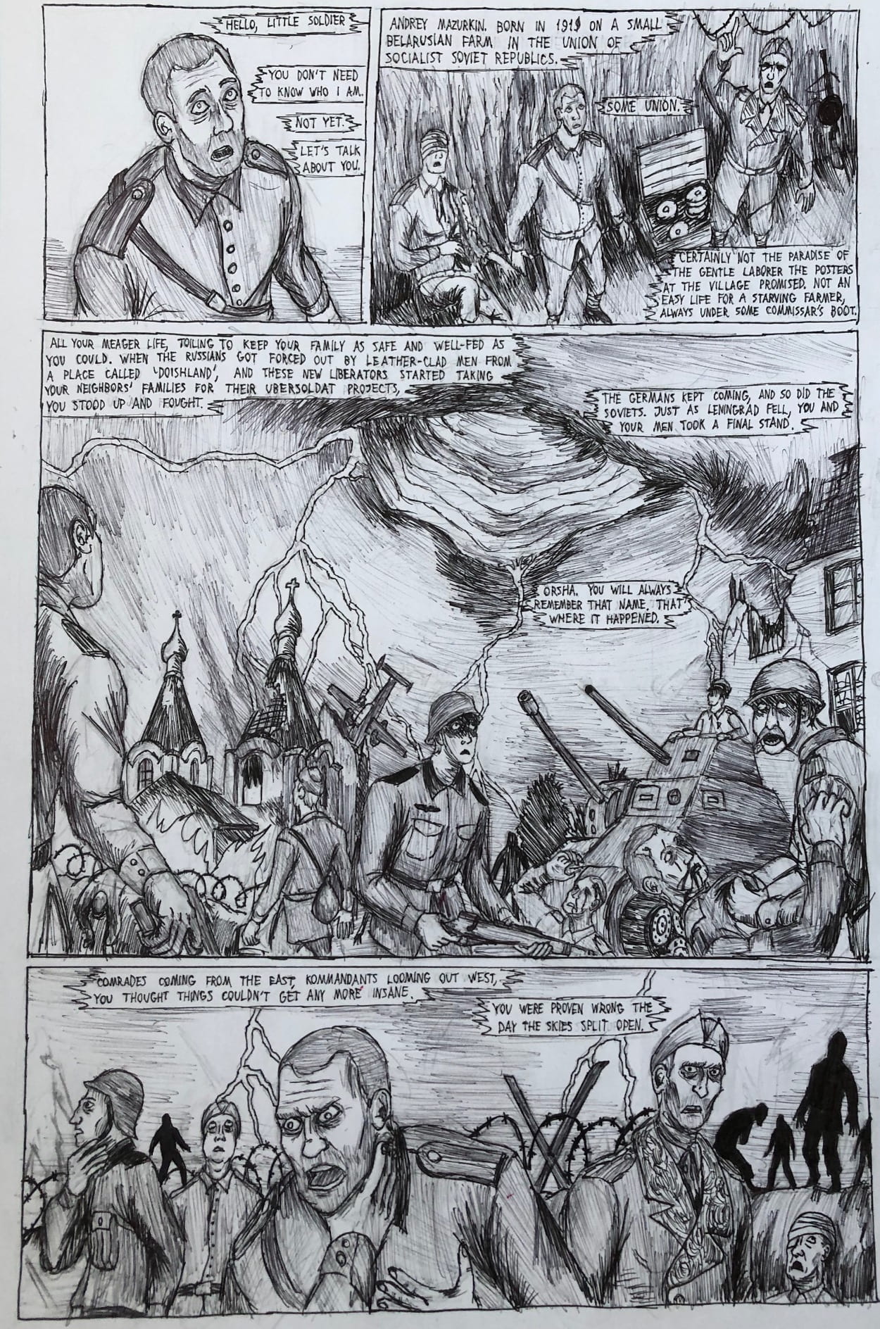
My first semi-legitimate outing into the sequential storytelling. I’m yet to truly incorporate ink wash and a lot of shading is evidently insecure, however I find the ink wash-lacking linework gives it a uniquely crisp look. This page actually took a day and a half of work, which was my first alarm bell that something needed to be changed.
Probably the only time I use a legitimate contrast of absolute black and white, though the test slightly muddles this unfortunately. I elected to leave this page without wash first because its presence may be distracting.
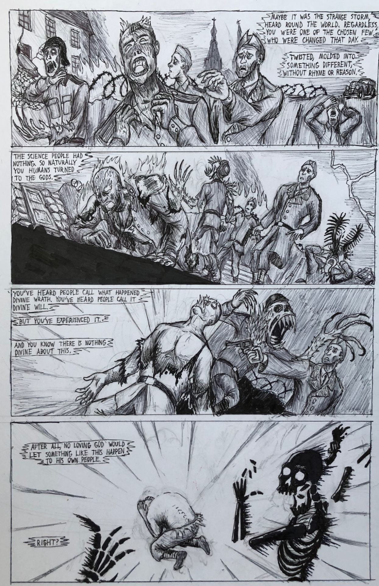
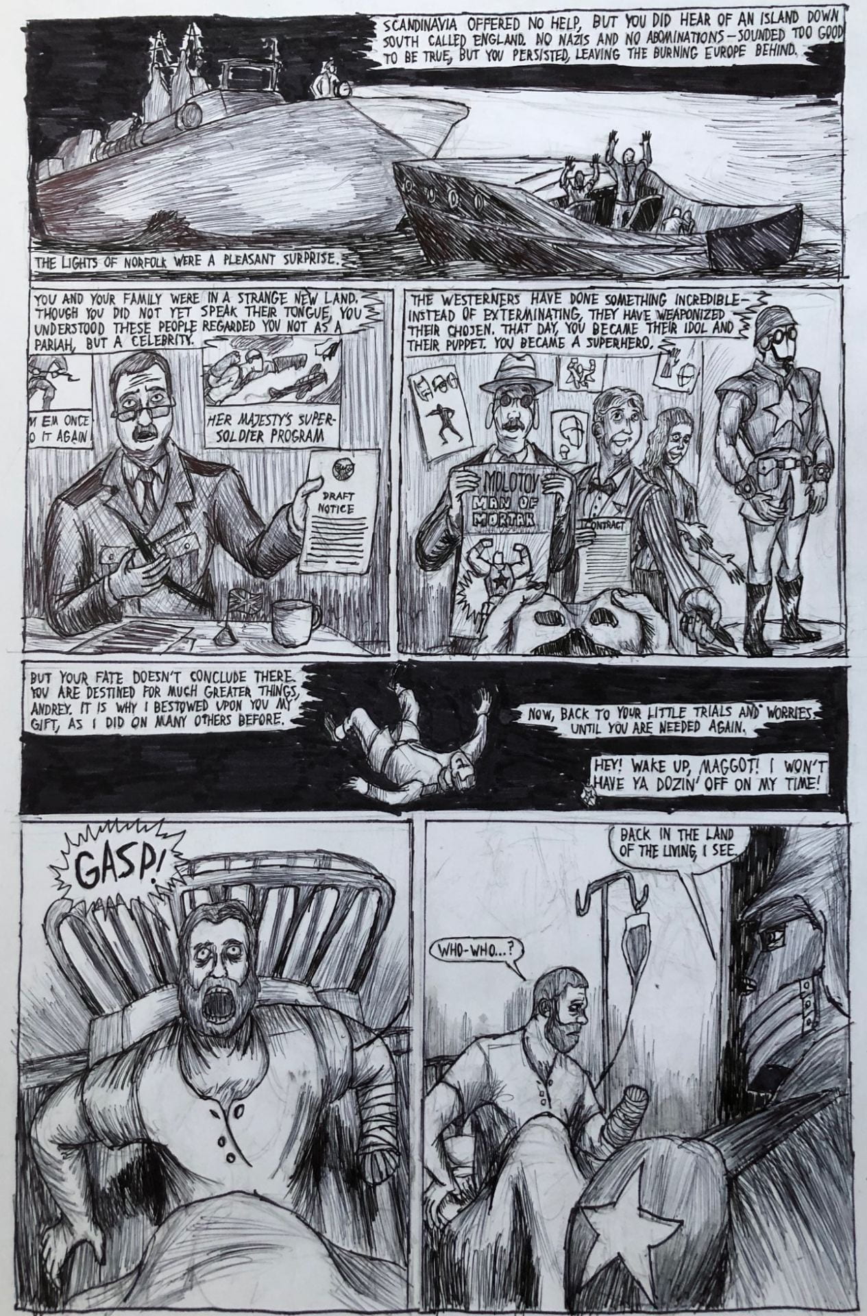
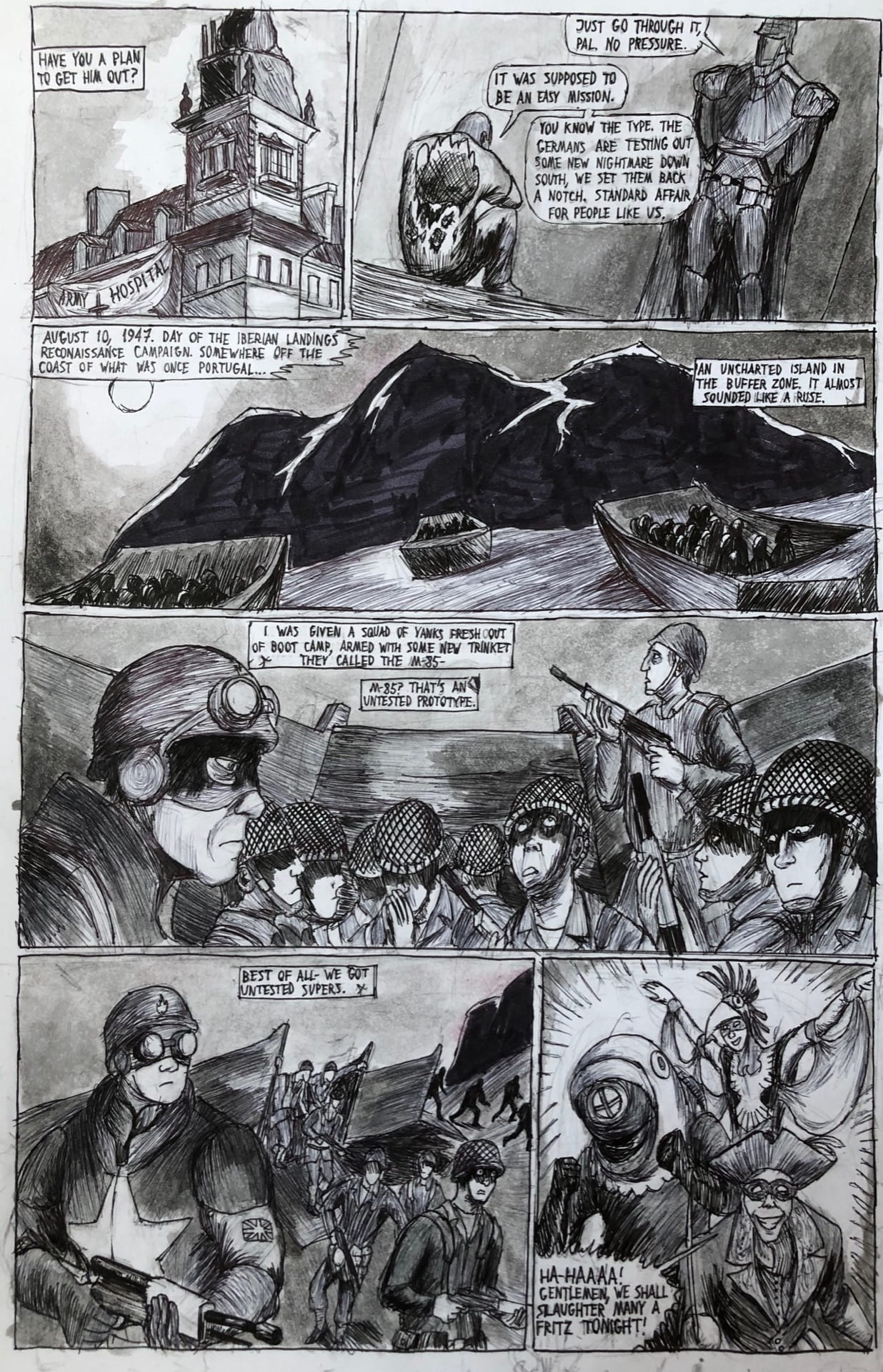
Sort of the first page where I can really showcase the weirdness of the world. Aside from some hokey facial expressions it’s overall a page I’m proud of, if only for the amount of diverse environments I got to showcase.
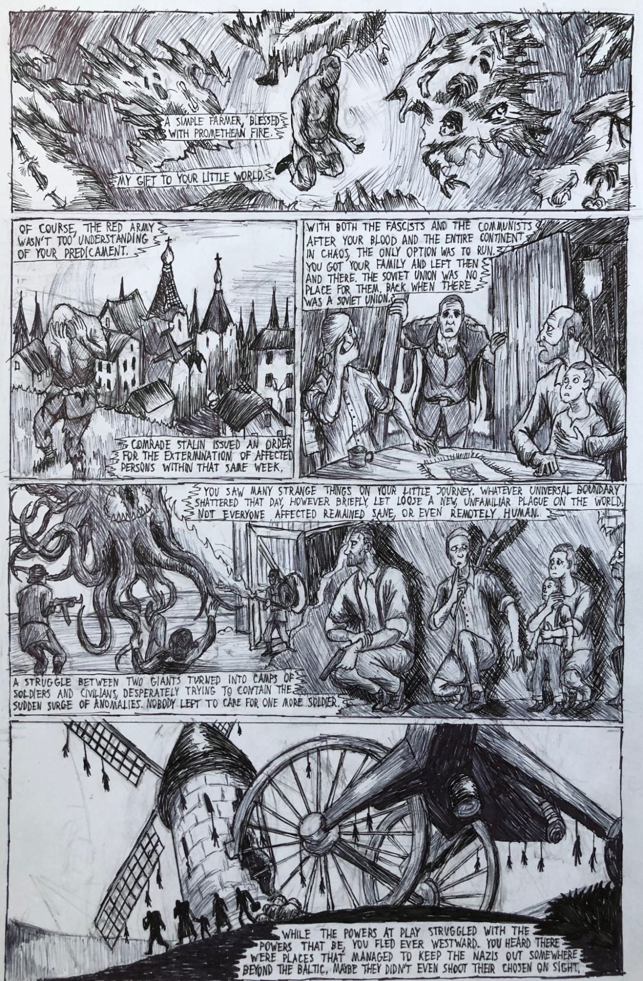
One of the only instances here I use an absolute black to portray a night sky. While stylish initially I went with ink wash from this point on to emphasize most of darkness just because it allows the color of the sky to be somewhat more dynamic.
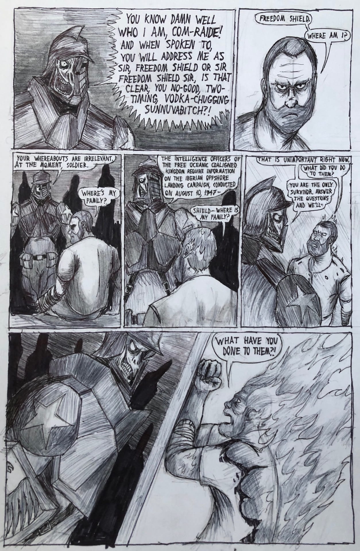
You may be at this point noticing a clear contrast between the dark greys and blacks on one side and the absolute whites. I initially wanted to include more detail in the room where the protagonist is held captive, however I figured keeping the background mostly white would not only provide some nice eye relief but keep the details of where he is held more enigmatic.
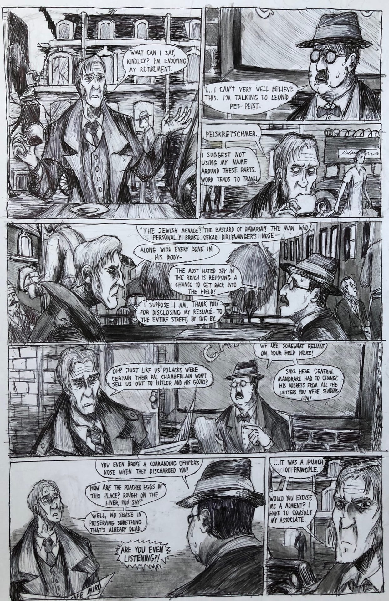
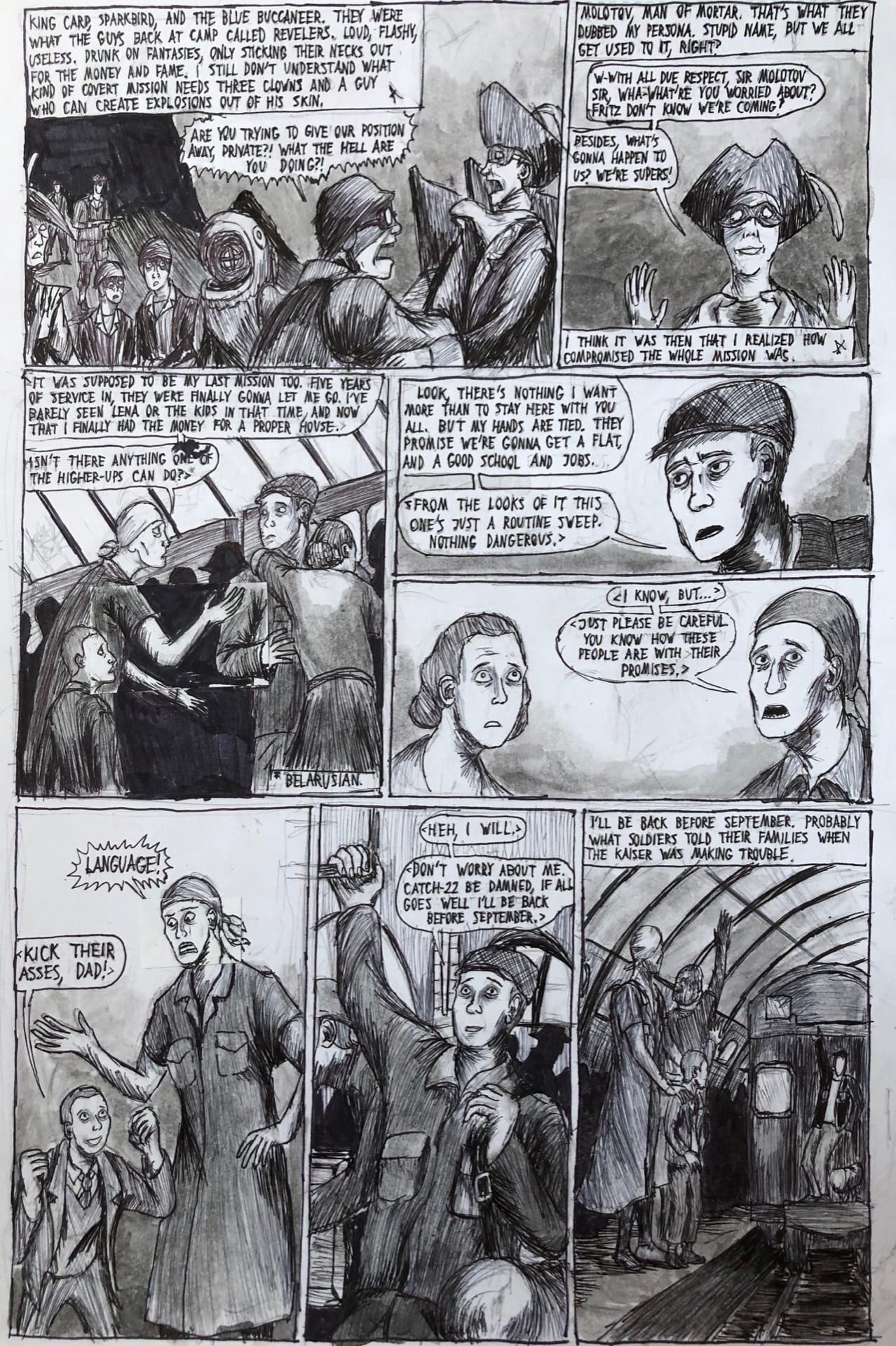
The first time I really have the opportunity to delve into faces, and overall it’s an effort I’m proud of. I think I fairly easily hit a good balance between cartoony and grisly and semi-realistic. It’s certainly a work in progress, especially what with oversized foreheads, but a good start.
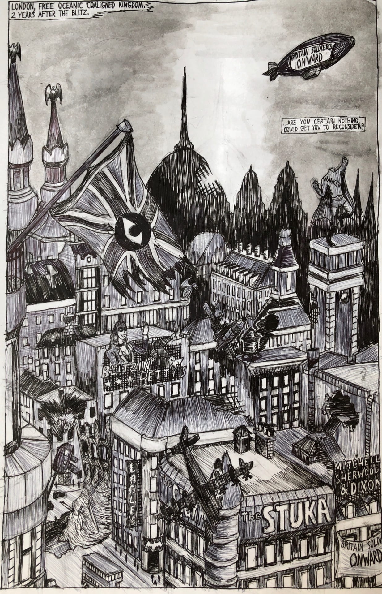
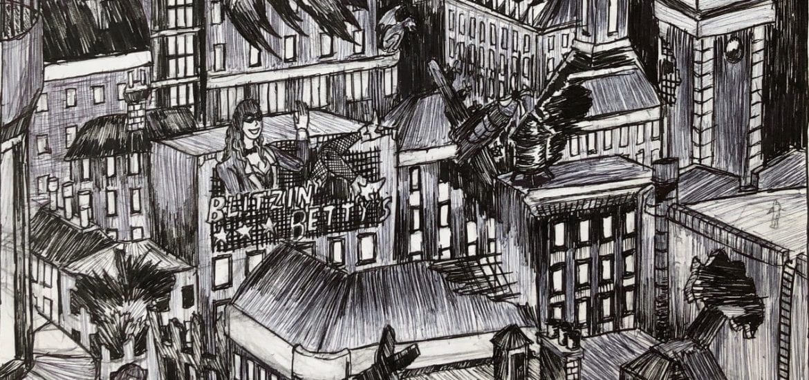
Okay, so this was actually the last page I drew for the project. It doesn’t add much to the plot but it does provide a nice amount of eye candy and actually establishes the setting. This may be the only time I really indulge in the weirdness of an alternate-history dystopian post-WW2 London where superheroes act as the main military body and law enforcement.
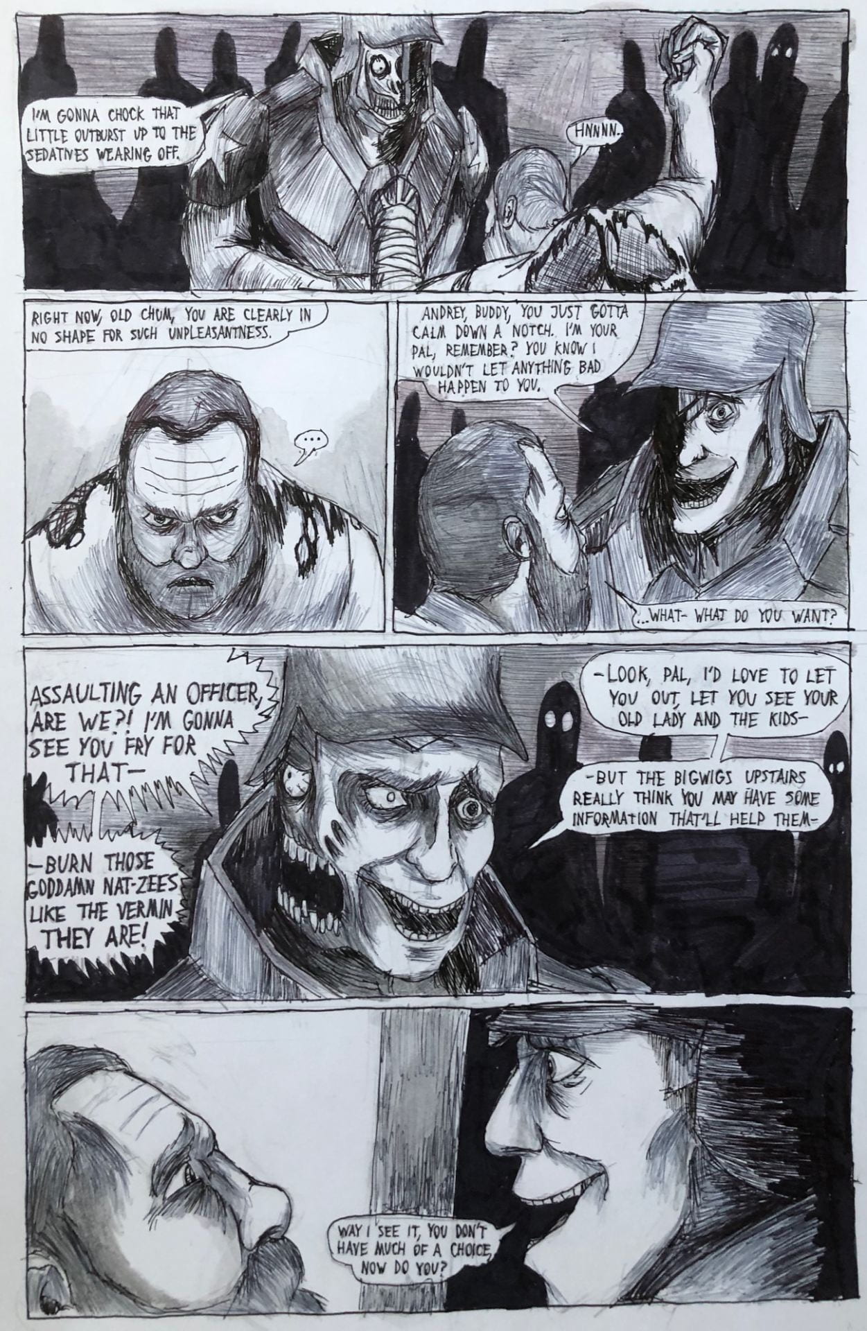
Dialogue, dialogue, dialogue. This page would be quite barren without severe ink wash assistance, but the pasty white faces help flesh out the characters, as do the slightly sharper blacks, again thanks to the liquid ink applied.
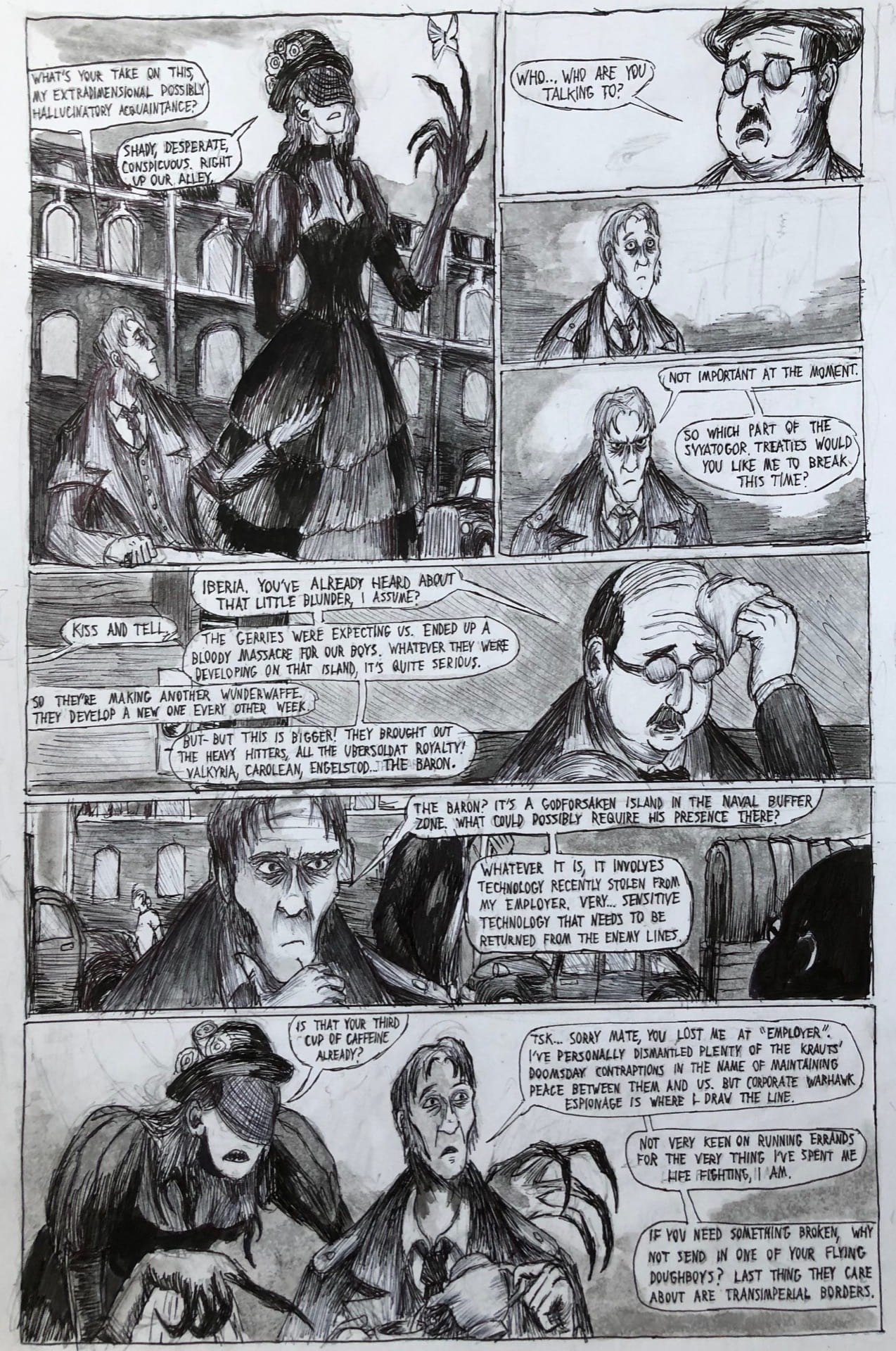
The difficulty in the female character introduced on this page involved making her largely black garbs stand out in front of an already dark grey background. I think the heavy blacks provided by the ink helped.
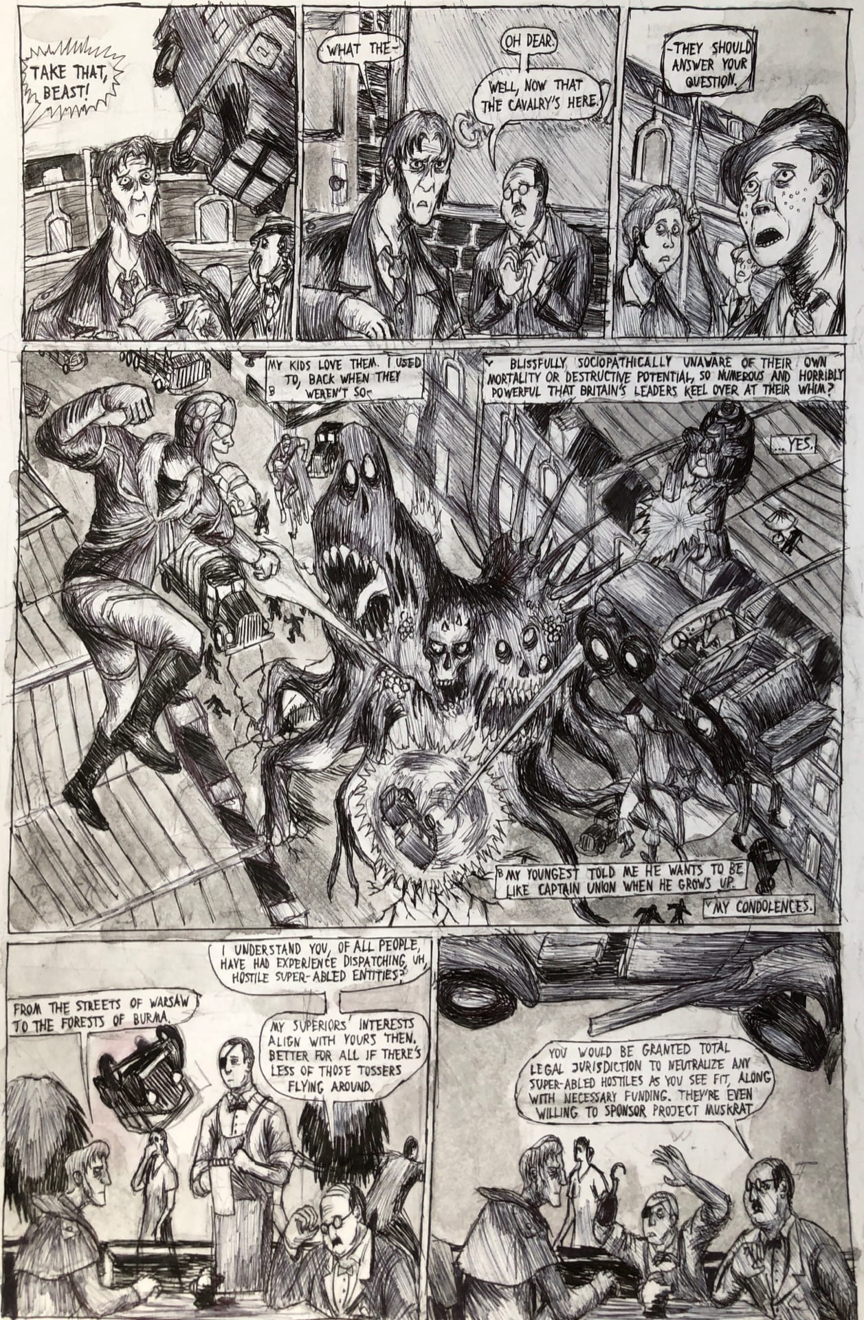
Evidently the bulk of the effort here went into the middle panel – this is my first opportunity to really show off the hedonistic, destructive and moronic superheroes plaguing this world like laser-eyed cockroaches, so I wanted to make the most of it. I also tried to keep the vehicle designed appropriate for 1947 England, so all vehicles present are based off real life rides.
As it turned out distilling some of the pre-applied non-micron pen ink gave me a nice 1960s schoolbook blue hue. Though unintentional I don’t think it undermines the quality a great deal.
I have made three different patterns to emphasize sky, land and water respectively, with a sky done in ink wash, a pitch-black sharpie mountain looming on the horizon and a water done in pen strokes. With this being the first scene set in legitimate darkness, I decided ink wash would create a much more dynamic background.
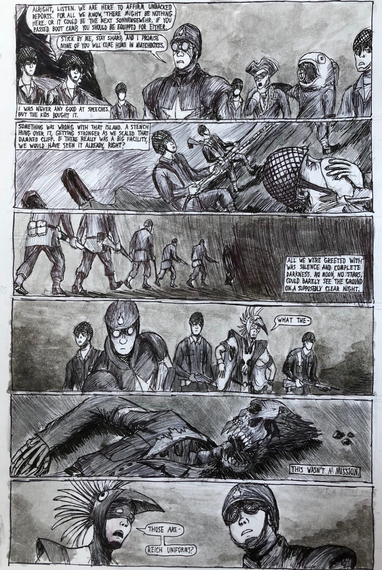
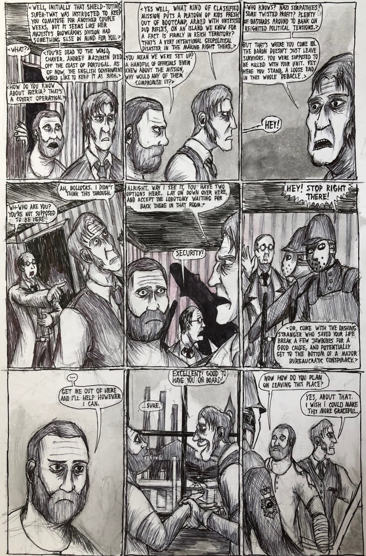
This being probably the most text-heavy page yet, the greys of the background were more of a last-ditch addition.
My endeavor to portray increasingly heavy darkness had some… mixed results. I don’t dare to use much wash here because the page is saturated enough as it is. This is the one time when backgrounds were markedly more difficult to properly execute.
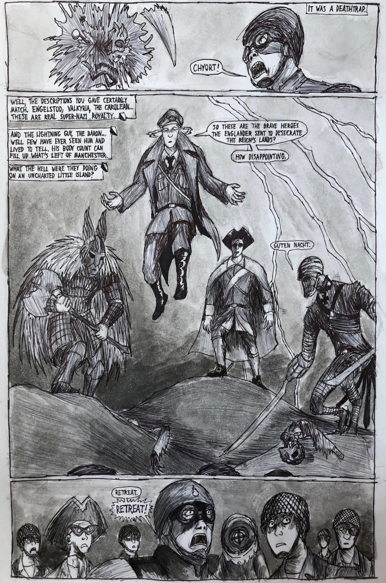
The grand introduction of some of the comic’s primary antagonists. Perhaps the lightning strike would be a bit more dramatic with the introduction of color, but as it stands it was ultimately a choice between having the lightning maintain its effect or having the characters be actually seen.
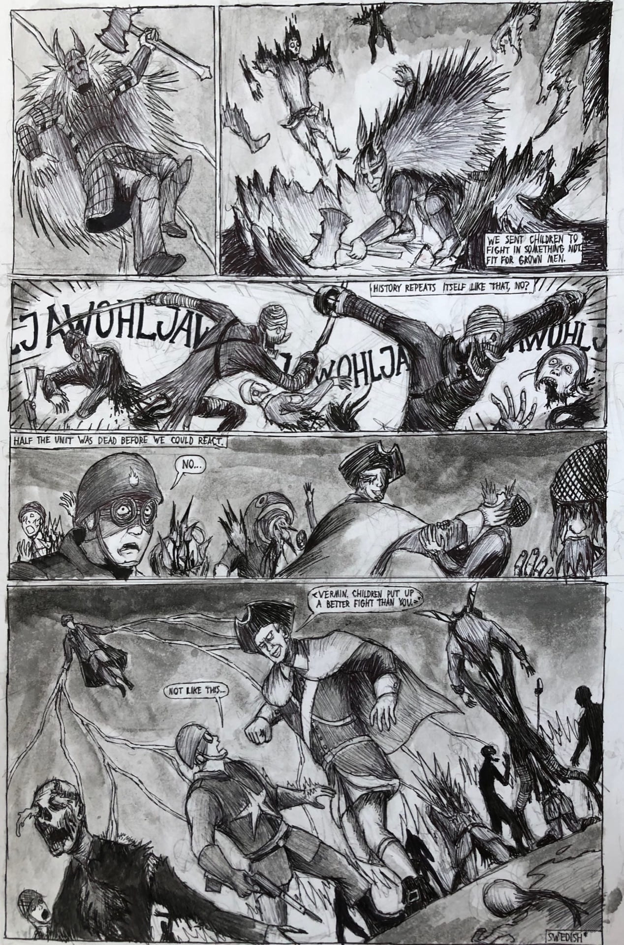
I sort of lament the lack of legitimate grit and violence in the comic as it lessens the impact, but this is really one of the few pages where it absolutely shines. I did dial back the initially intended blood and viscera a bit, because this is a school project at the end of the day.
Believe it or not, this is actually the page I actually spent the most time on, simply because I went off-script and headfirst into improvisational territory, so it was important to get the fight choreography right while hitting a few important beats (such as the protagonist losing his left hand) within a pre-set page limit.
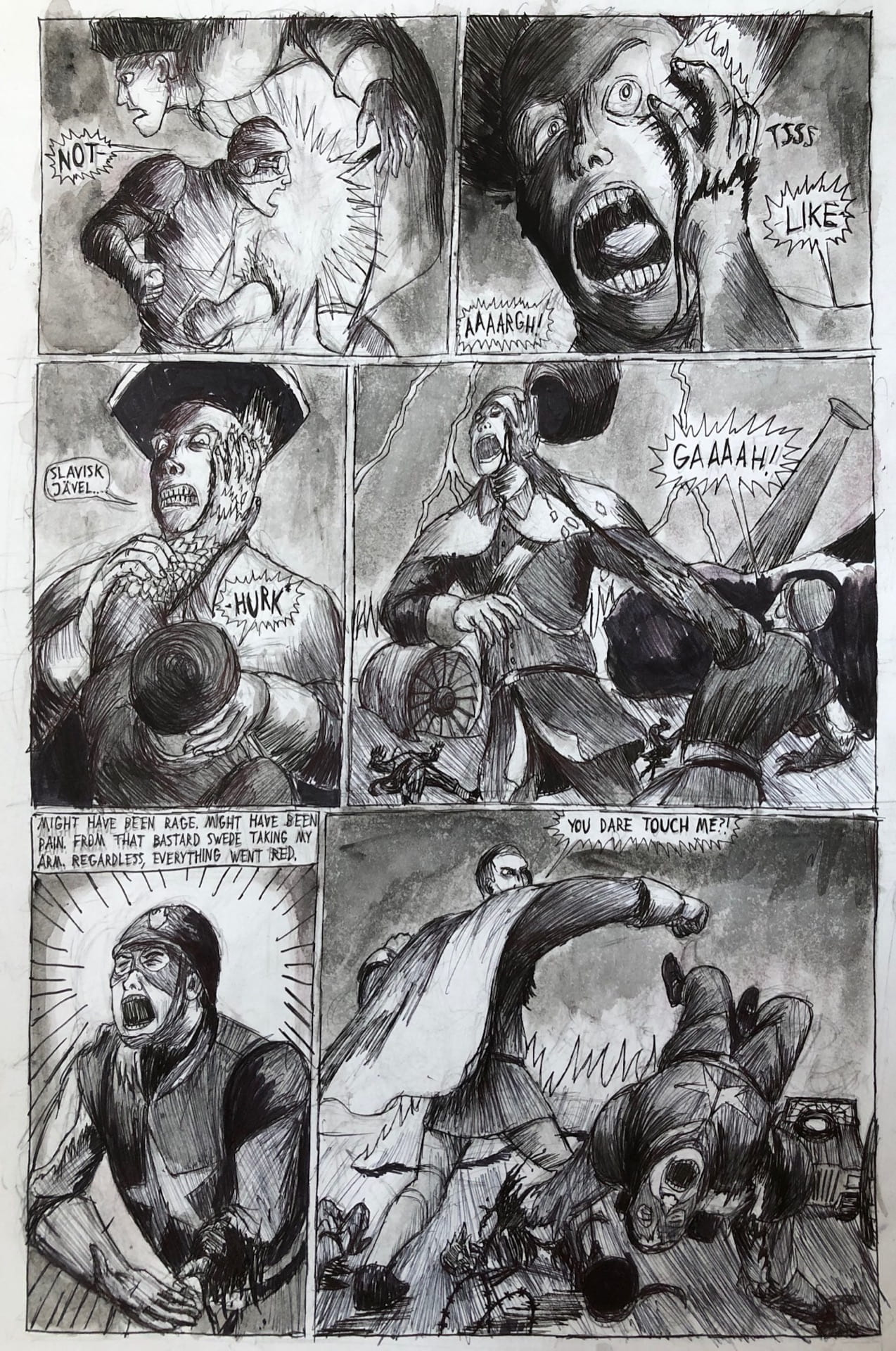
Again, this is a page where I HEAVILY dialed back the visceral effects. Though really packed in its composition (probably the busiest out of any other pages in the comic) it does ultimately hit all the beats I want it to in a short period of time.
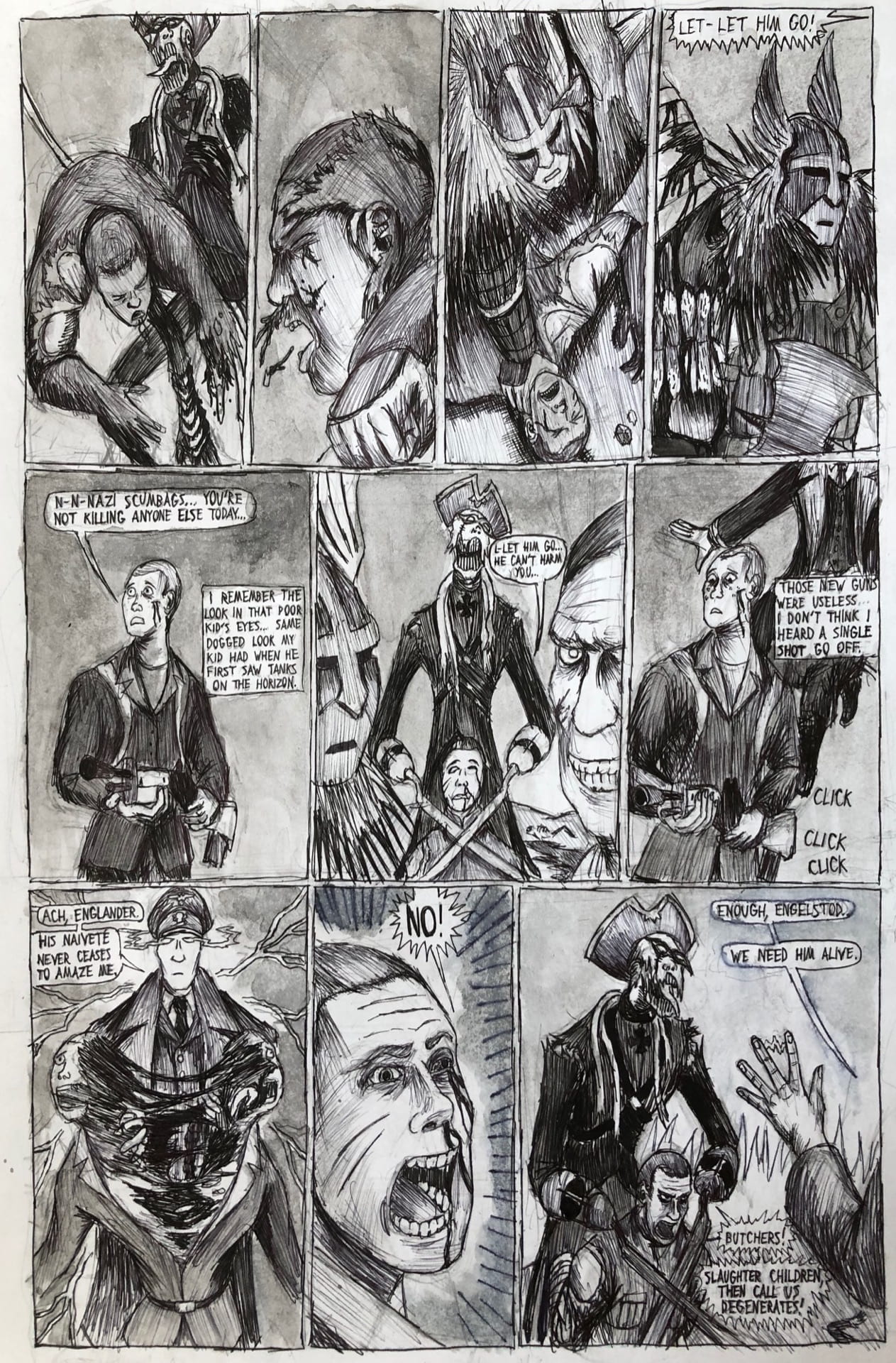
You can see an ever-so-subtle patch where I made an artistic error in the bottom panel. My one regret in this page is perhaps not making the sky a little darker (day and night apparently have the same sky color in this universe). Aside from that the middle panel should provide a nice break from the tiny, text-filled panels already plaguing this comic.
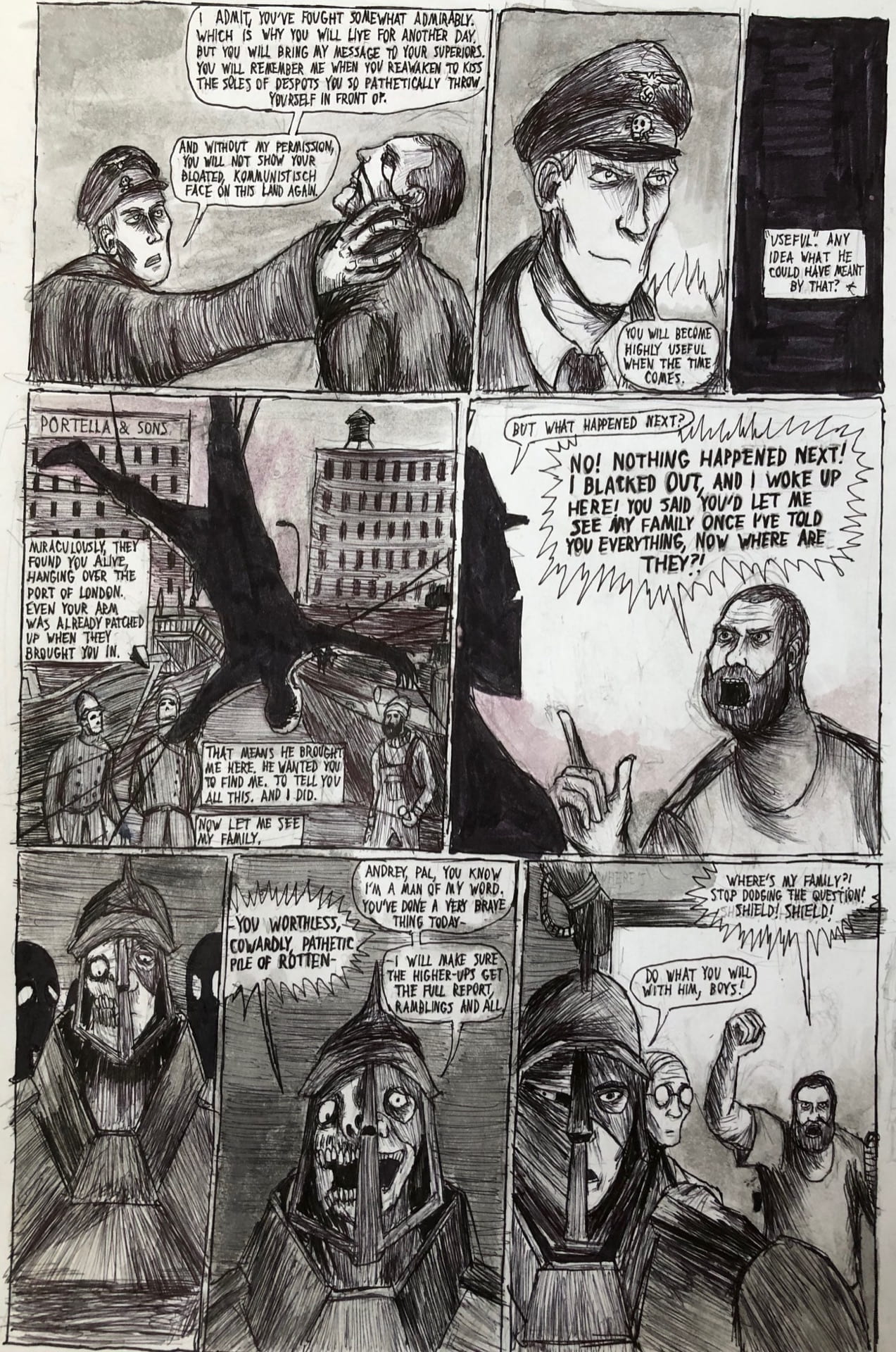
The flashback sequence had to be cut a little bit short at the top in the interest of space conservation (technically with the establishing shot at page 7 I already went over the limit a tiny bit). Perhaps I should have made the wires suspending the character a little thicker so as to show that he is in fact suspended and not levitating.
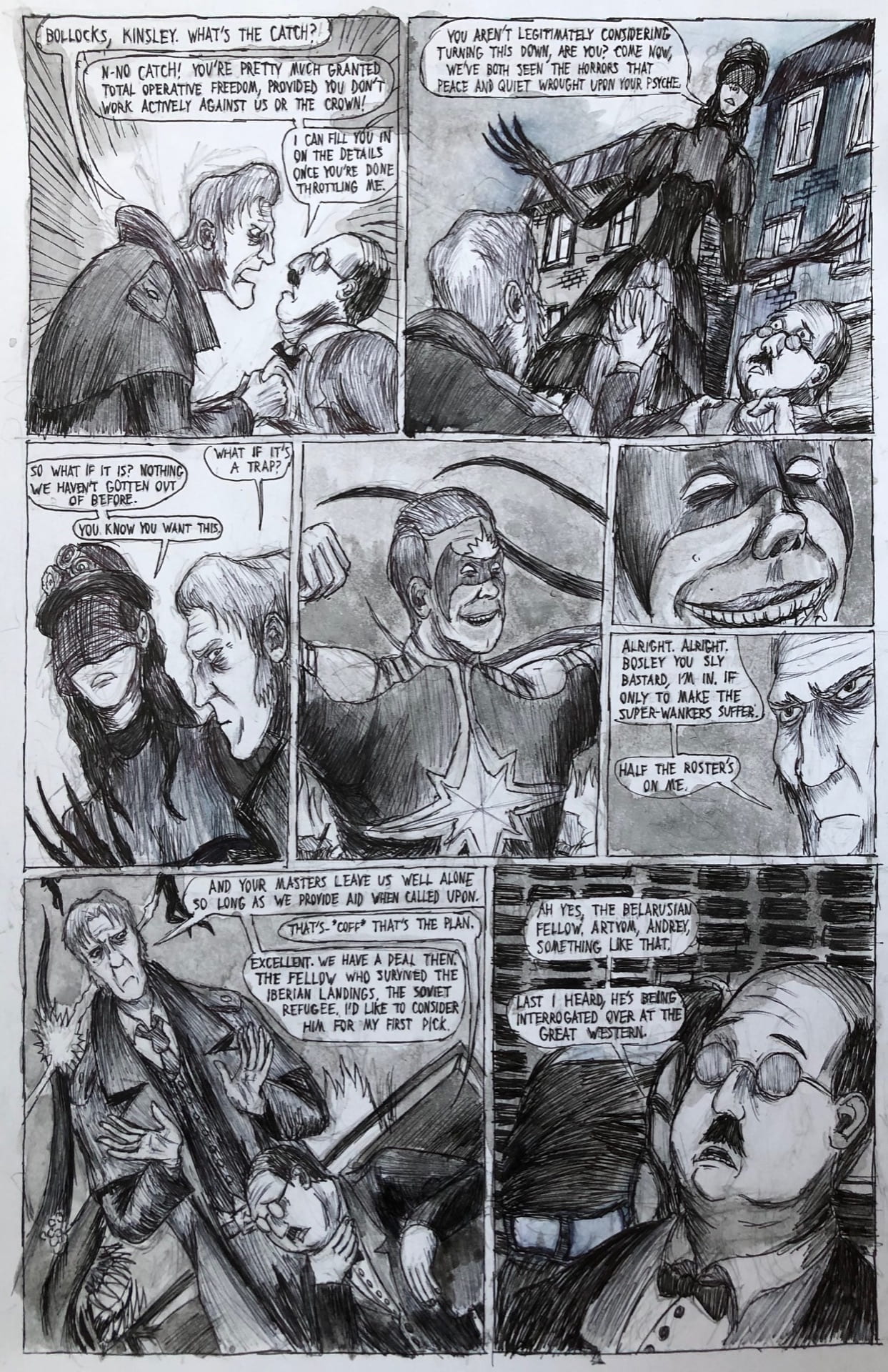
A fairly simple page that’s largely just a vehicle for the dialogue. By this point I have full-on embraced the ink wash as a friend, as can be seen by its increasingly liberal use in the grey backgrounds.
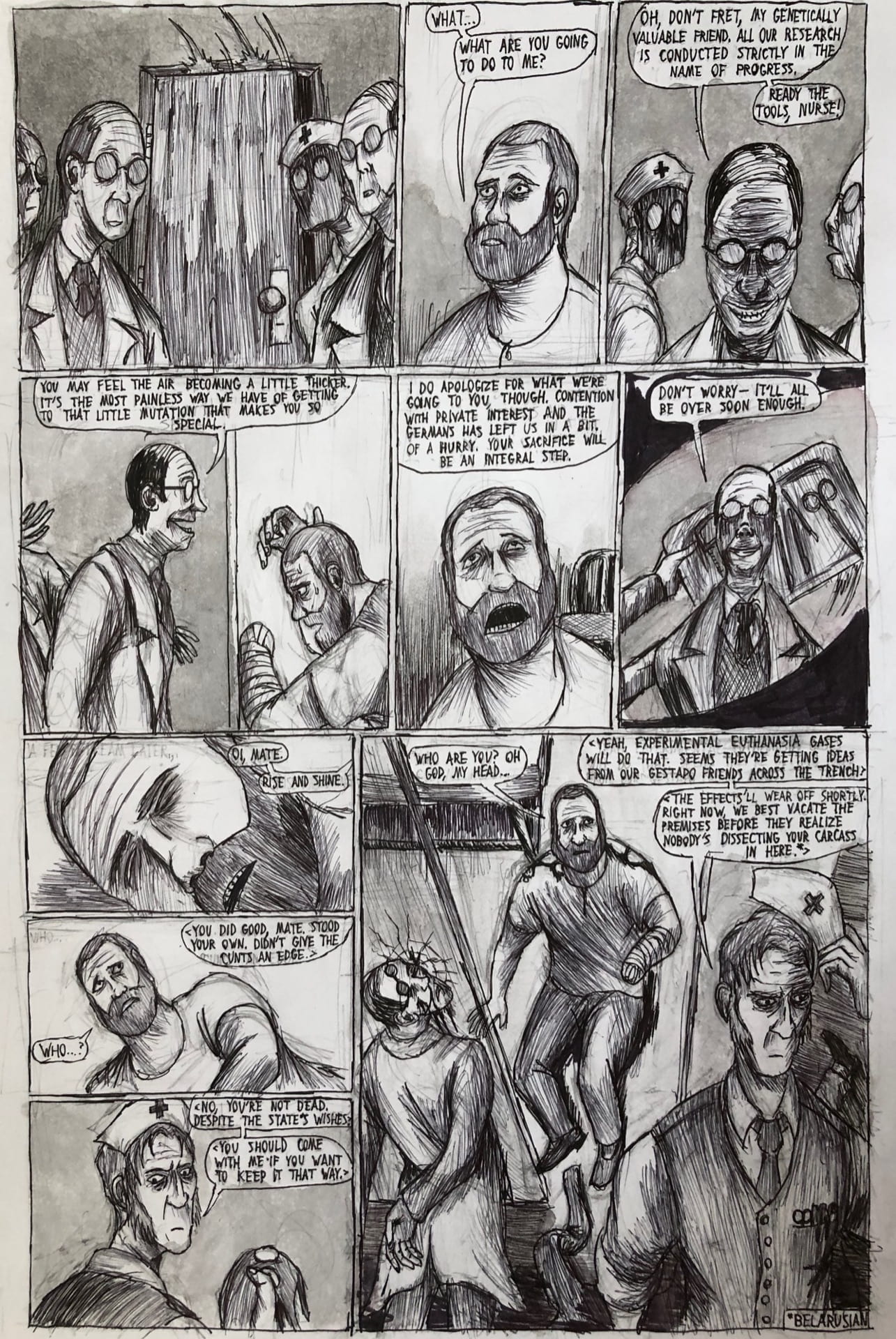
At long last I have another opportunity to draw some close-up faces, and experiment further with the two protagonists-to-be’s somewhat unconventional facial complexions.
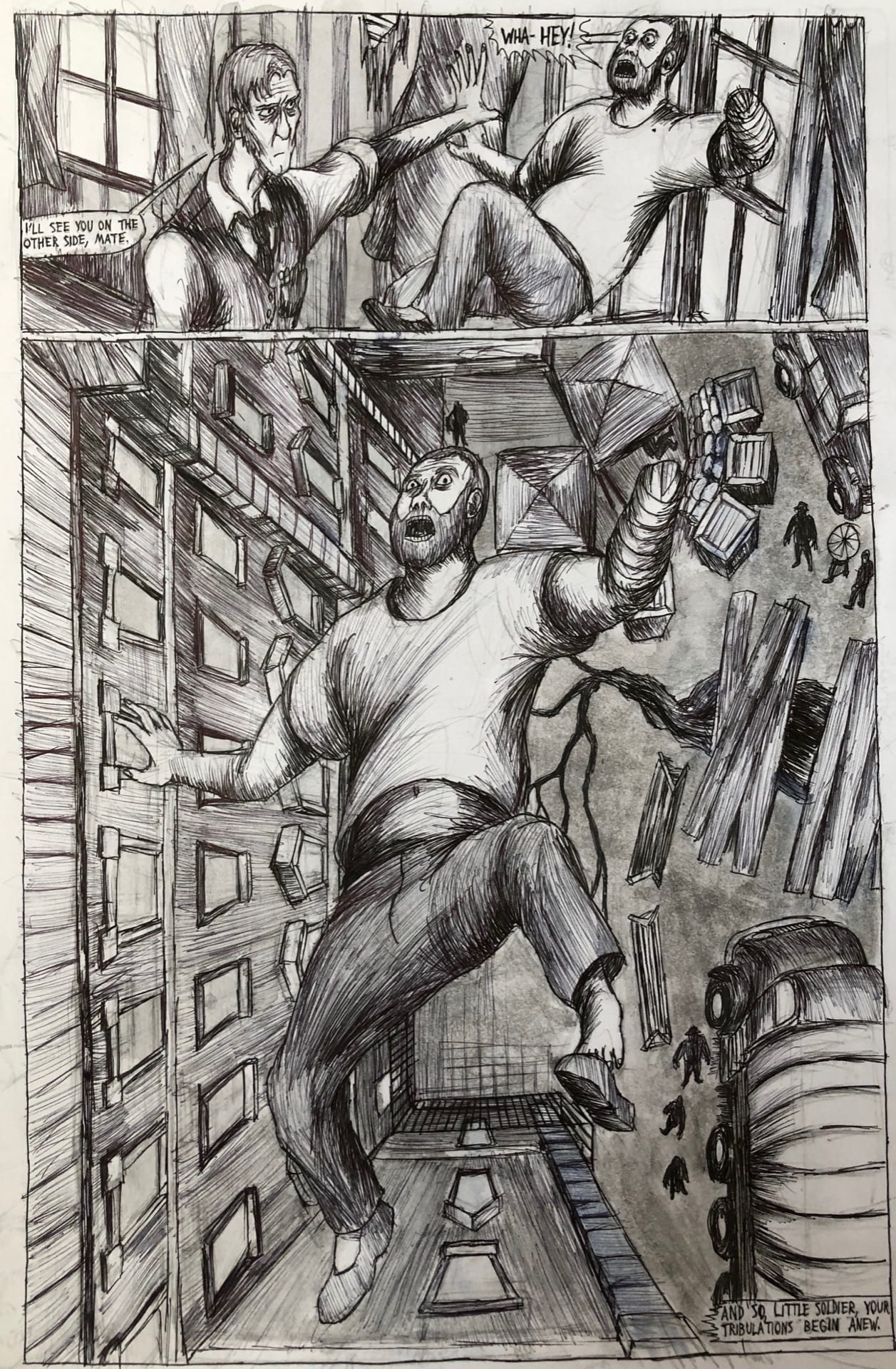
This final page I wanted to genuinely stand out, and genuinely stand out it did. I’m fairly glad I left a few parts pitch-white (such as the protagonist’s shirt) as it really helps this page stand out more so than some of the other pieces.